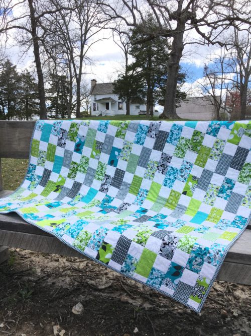
I began this quilt in 2013 after Scott gave me the charm packs of fabric for Christmas in 2012. I cut up the colors and the white background squares, put them in a project box, and got distracted by shiny new things. Then in a fit of wanting to finish projects with fabric I already owned so I could buy more, I sewed up the top in 2015 and put it back in the project box to wait until I had time to hand-quilt it. Because that takes a long time, and others were getting done which had priority, plus I still didn’t have anything for backing. Then I found some blue Mimosa fabric on clearance last year and picked that up for backing. Added it to the box but still didn’t have time in the queue for hand-quilting because I was working on a hand-applique quilt with my quilt group. Then in February I found some gray Mimosa fabric on clearance that was perfect for the binding, so I picked that up. All the pieces were in place.
What motivated me to get it done all of a sudden? My quilt group convinced me I could do straight-line quilting on my own sewing machine. And I needed another quilt to take on our early April road trip and sew binding in the car. So I dug it all out at the end of March, did the quilting in two sessions over two days, made the binding and sewed it on, then packed it for the trip. I sewed on the binding as we drove to the Midwest and got a photo shoot at Almanzo & Laura Ingalls Wilder’s farm on one of the few non-rainy days of the trip. And it’s a finish for the win!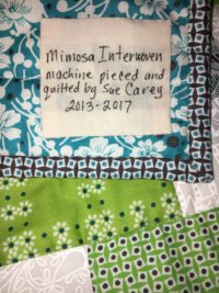
The pattern is a free Moda BakeShop Original Recipe by Material Girl Quilts called Interwoven. It looks like the fabric is kind of woven like a basket. The top used two Mimosa by Another Point of View for Windham Fabrics charm packs in the turquoise, lime, and gray patterns of the line, and the back and binding are also from the Mimosa line. I don’t know the white background I used, but it has tone-on-tone swirls that are very cute up close. I used white thread and quilted in the ditch along every horizontal row and vertically down the columns which each included a color and a square. So the quilting is very low-key but I like it and for my first attempt, it’s good. A label finishes it up and it’s another quilt checked off my WIP chart for 2017!
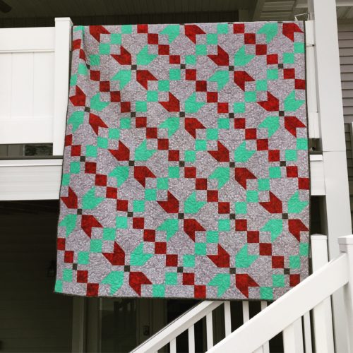
 as the reds and greens line up into chains across the quilt. The green is Dapples by Free Spirit for Westminster Fabrics and the red is Essentials by Wilmington Prints. The gray background is a fleur-de-lis type swirl called Jams & Jellies by Jill Finley for Henry Glass & Co., and the small square centers and the binding are Atelier by 3Sisters for Moda. It was machine quilted with gray thread using the Drop of Paisley pattern by Linda at Just Sew.
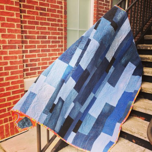
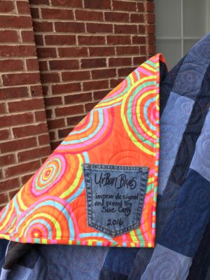 bright and fun to offset the dark blues. I had planned to just fold over the backing for the binding, but a happy accident required me to cut and do a binding the regular way. And with all the concentric circles, it makes a nice, almost striped, contrast to the backing which I really love. So it turned out great even though it ended up being more work than I had planned.
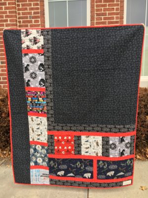
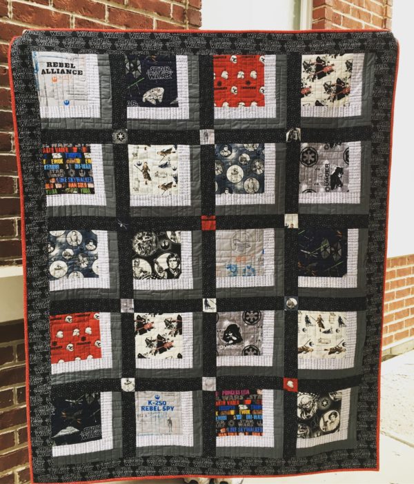 The first is called “Star Wars: Past & Present”. New lines of fabric had been released for the “The Force Awakens” and was readily available but Mark grew up with the original trilogy and is a fan of all the films. (Hence the request for a Star Wars quilt). So I scoured the interwebs for classic fabric pieces and found them in a variety of Etsy shops. The pattern is called “Groovy” from Quilt Etc. in Sandy, Utah that I was given during a shop hop. The fabrics used are a charcoal Peppered Cotton, and Thicket Dashes from Gingiber for
 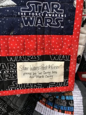 the log cabin sides. The sashing & large backing pieces and the binding are Starlet Black Star and Red Star respectively, from Blank Quilting. The border is “The Force Awakens” from Camelot Fabrics, along with the large squares from their various Star Wars collections. I fussy cut all the large squares to show the pattern to best effect and in the case of the badges, to show different characters as much as possible. Also the classic word squares are slightly offset to show different names at the top and bottom. I also fussy cut the cornerstones to show off a character or symbol. I really love how that little extra effort turned out. Those cornerstones really pop!